The Most Common Mistakes in Architectural Wayfinding Systems

September 14, 2026 · Updated: September 14, 2026

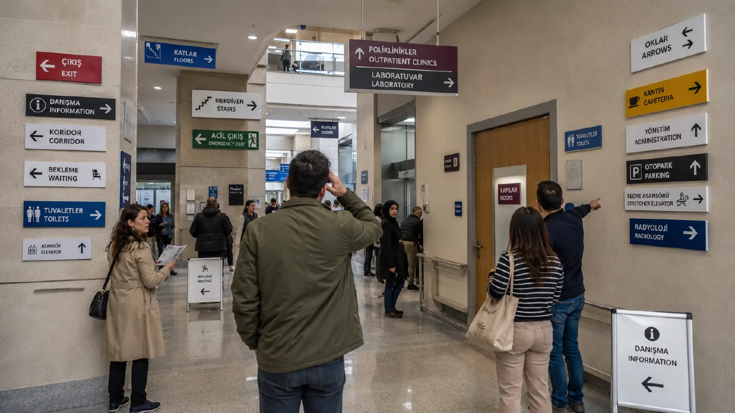
Why Flawed Wayfinding Strategies Fail in Hospitals, Malls, and Civic Complexes

Architectural wayfinding systems are critical infrastructures that directly shape the user experience in hospitals, shopping centers, public institutions, and large-scale developments. However, when these networks are poorly planned, they achieve the exact opposite of their intent, generating severe spatial confusion and operational bottlenecks.

A common query searched globally by facility managers is: "Why are our directional signs ineffective?"

The answer almost always lies within these fundamental wayfinding design mistakes.
1. Treating Wayfinding Merely as Physical Signage

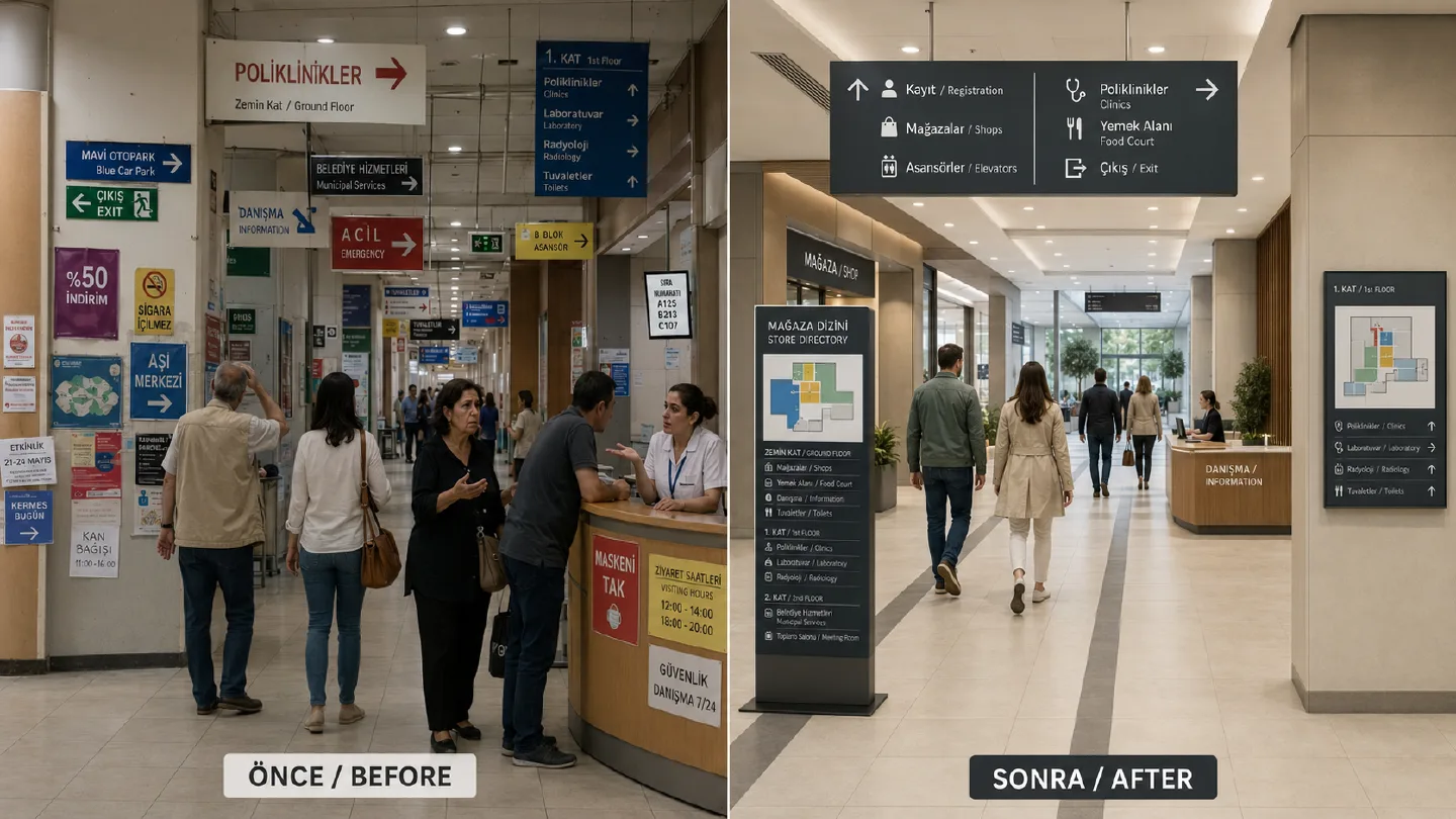
This is the single most prevalent mistake in real estate development. In many projects, an architectural wayfinding system is oversimplified to mean:

  • Mounting a sign on a door.
  • Sticking an arrow graphic onto a wall.
  • Printing floor lists next to an elevator.

In reality, strategic wayfinding is an integrated system that maps every cognitive decision a user makes from the perimeter entry to their exact destination. Fragmented sign installations executed without this holistic framework:

  • Abandon the user mid-journey.
  • Lead to counter-intuitive routes and wrong turns.
  • Create high-stress environments where staff are constantly interrupted for directions.

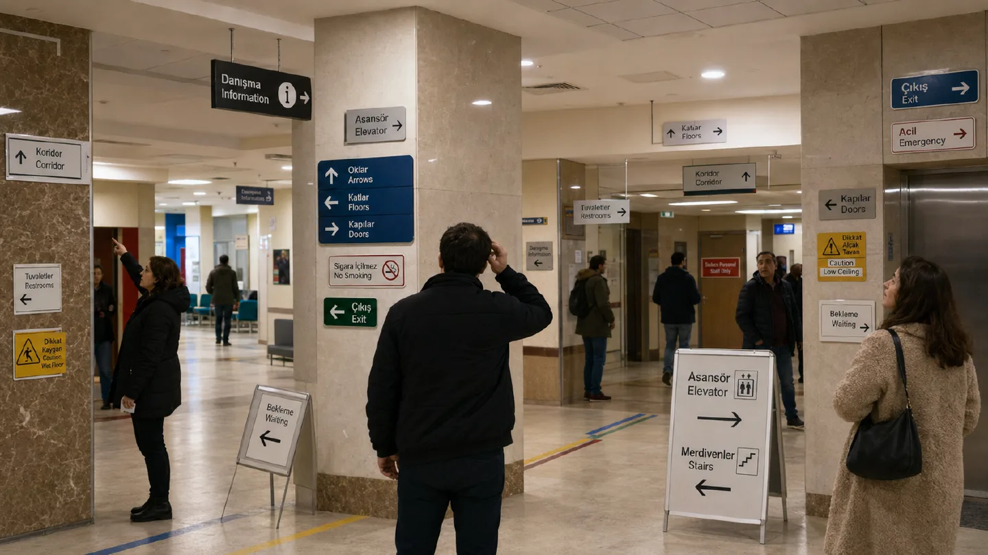
2. Failing to Map Strategic Decision Points

Effective directional signs do not need to be everywhere; they need to be at critical decision points. Elevator lobbies, corridor intersections, transitional zones, and primary entrance vestibules are the exact thresholds where a user stops to think, "Where do I go now?"

Signage installed without a prior spatial traffic analysis at these intersections will be:

  • Visually overlooked by the user.
  • Misunderstood due to cognitive overload.
  • Completely dysfunctional.

Particularly within hospital wayfinding systems, this error leads to lost time, missed appointments, and heightened patient anxiety.

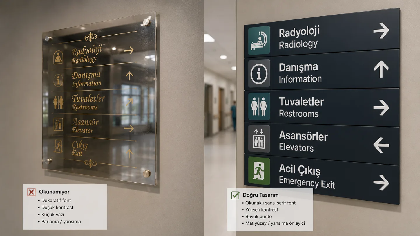
3. Using Fonts and Graphics with Low Legibility Standards

Overly decorative fonts selected purely for aesthetic appeal are the silent killers of spatial navigation. Common errors include:

  • Ultra-thin or overly stylized typefaces.
  • Low-contrast color combinations (e.g., light grey text on a white background).
  • Inadequate font sizing that cannot be deciphered from standard viewing distances.

The Result: The physical sign exists, but it is unreadable. In professional environmental graphic design, signage legibility standards must always take priority over artistic trends.

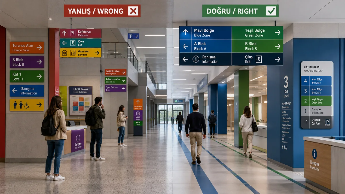
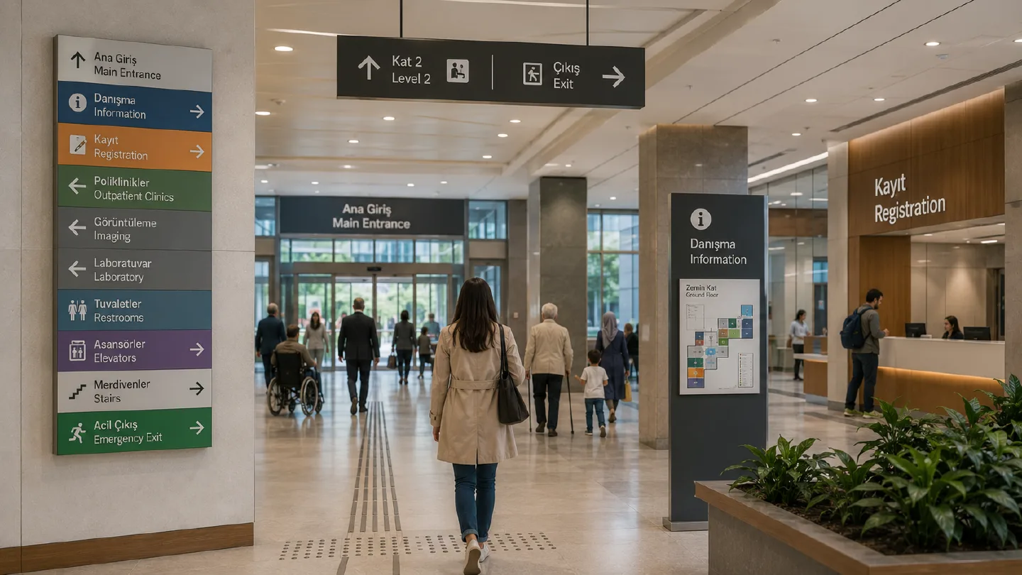
4. Inconsistent Color-Coding and Zone Mapping

Color is one of the most powerful intuitive tools in spatial navigation. However, when applied inconsistently, it accelerates confusion.

Frequent design flaws include:

  • Utilizing the same color spectrum for entirely different functional meanings.
  • Lacking a clear color distinction between different floors, blocks, or public vs. private zones.
  • Selecting arbitrary color palettes based on interior trends rather than cognitive mapping.

In a properly engineered architectural wayfinding solution, color coding creates an immediate mental map within the user's subconscious.

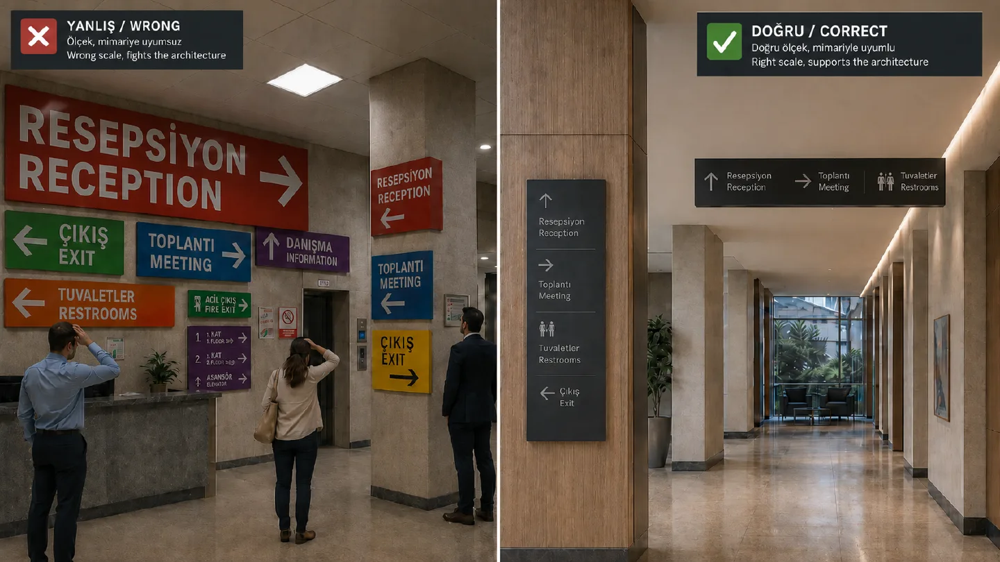
5. Signage Elements That Clash with the Architecture

Wayfinding systems should naturally complement a space, not overwhelm or clutter it. Common execution errors include:

  • Out-of-scale, disproportionate signage modules.
  • Structural elements that look like unintegrated, afterthought add-ons.
  • Structural profiles and materials that disrupt the building's overall architectural language.
  • This lack of cohesion diminishes the premium look of the property and weakens the facility's corporate brand perception.

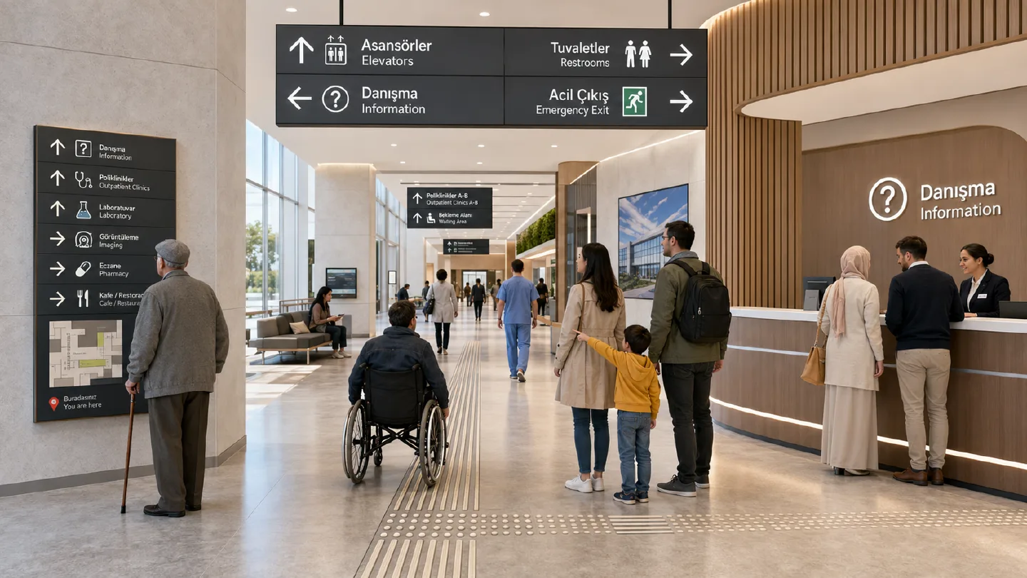
6. Disregarding the Diverse User Profile

No two facilities share the exact same demographic. Hospitals, commercial shopping centers, airports, and corporate campuses host visitors with vastly different age groups, cultural backgrounds, and stress levels.

  • Wayfinding networks designed without these behavioral differences in mind:
  • Fail to be universally intuitive.
  • Slow down pedestrian traffic circulation.
  • Exhaust the visitor mentally.
  • Professional wayfinding design always employs a human-centered approach, prioritizing universal symbols over regional text.

7. Overlooking the Value of a Specialized Signage Consultant

Perhaps the most costly mistake is failing to partner with a specialized manufacturer from day one. Architectural wayfinding is a highly interdisciplinary practice requiring expertise in:

  • Environmental graphic design
  • Spatial architectural analysis
  • Human behavioral psychology

Material engineering, precision manufacturing, and installation standards

Wayfinding should never be treated as an "interior detail to be solved at the final stage." It must be treated as a core system integrated from the project's schematic phase.

Key Criteria for a Flawless Wayfinding System

An optimized, error-free navigation system delivers:

  • Seamless orientation focused entirely on critical decision points.
  • Superior legibility under all lighting conditions.
  • A highly unified and consistent graphic design language.
  • Complete integration with the structural architecture.
  • An effortless, stress-free user journey.

Most importantly: It enables a first-time visitor to reach their destination autonomously, without ever needing to ask for directions.

Yöntime | Error-Free Architectural Wayfinding Systems

Yöntime is a global architectural signage firm and wayfinding consultant specializing in creating flawless, high-performance navigation systems for hospitals, shopping malls, public complexes, and urban infrastructures.

For every international project, our specialized team:

  • Conducts in-depth user behavior and circulation analysis.
  • Strategically maps out spatial decision thresholds.
  • Engineers signage for maximum legibility and seamless architectural integration.

The Result: We design, manufacture, and install turnkey wayfinding systems that don't just decorate a space—they solve complexity.